January 30, 2011
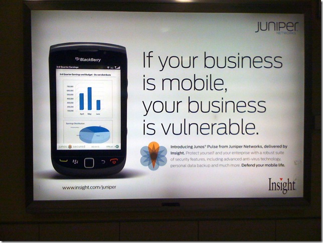
Your business is vulnerable to a 3D pie
I was walking through the airport after a long three days in Toronto and I was stopped dead in my track. This caught my attention. I had to catch my breath and wipe away the tears of sadness and frustration.
My first reaction was “OH NO! They’re pimping 3D bar and pie charts as a way to monitor corporate security!” Then I thought about it some more and laughed at the irony of two phrases in the advertisement:
- “Defend your mobile life”
- “Your business is vulnerable”
If you think about it, they’re 100% correct. Your mobile business is vulnerable and you must defend its life against 3D bar charts and pie charts. Stop the madness!
January 29, 2011
LinkedIn Maps – My Professional Network
LinkedIn added a cool tool to its website recently. Get yours here.
January 24, 2011
Getting right to the point - A simple, well-executed bar chart by Nielsen
Nielsen released it’s quarterly consumer confidence index report today and their effort to produce a meaningful chart is much better this time. You may recall I was critical of them earlier in the month.
This chart is clear and to the point. Within seconds you can:
- See that there are approximately as many countries with an increase in consumer confidence as there are with a decrease
- Find your own country, see where it ranks and how it compares to the average
There are many well done aspects to this chart:
- The color choices for the bars makes them easily distinguishable
- The legend is out of the way, but easily referenced
- The title clearly indicates what you are reading
- The subtitle gives a super quick summary that gets right to the point
January 22, 2011
Guess who’s at #68 of Tableau’s Top 100 Vizes of Q4 2010 ?
Ellie Fields from Tableau contacted me today to tell me that one of my vizes made the top 100 in Q4. I’m not entirely sure what drove traffic to it, but the viz had 1568 visits in Q4 with 19% of those interacting with the dashboard.
Check out Tableau’s list here.
While #68 may not get you too excited, it does humble me to know that people are actually interested in the content I create. That’s the best compliment anyone can ever give and you all help to keep me inspired.
Check out my original blog post here. It was a critique of Many Eyes in which I posted an improvement on their viz. Thanks for visiting!!
January 17, 2011
The greatest 16-minute speech ever: "I Have a Dream"
From the TED Blog:Many of us know Martin Luther King Jr.’s 1963 “I Have a Dream” speech from snippets and news clips. If you have time for reflection today, watch it here, all the way through. It’s unmissable. In an era of open injustice and brutal hatred, King challenges his listeners to actively build a better world for themselves and their children. We know the highlights, but watching the whole 16-minute speech makes the context of ’63 shatteringly clear, and underscores the clarity and power of MLK’s vision.
January 11, 2011
CANCELED: January ATUG Meeting
January 9, 2011
Shouldn’t I expect better from Nielsen?
The image below is from an article on Nielsen, but that’s not important. I can’t make any sense whatsoever of this chart.
I’m stumped because the gray area is for under 24, the blue is for under 15 and the light blue is for under 15. Huh? I was hoping for a legend, but nope, there isn’t one.
There’s only one word to describe this chart: AWFUL!
January 4, 2011
COMING NEXT WEEK: Atlanta Tableau User Group (ATUG) meeting - January 13th from 1-4p @ Norfolk Southern
The next ATUG meeting will be January 13 @ 1PM ET
Who - All ATUG members and guests
What – The January in person hands on meeting
Where - Norfolk Southern building located at 1200 Peachtree St NE. Atlanta, GA 30309 - room 3076
RSVP – http://events.linkedin.com/January-2011-ATUG-meeting-1-13-1-4pm/pub/519381
Agenda:
- Training – Rapid Fire BI: How to quickly get the most out of Tableau
- Team project – Are you ready for some football?
- February meeting – Location, time, agenda
-- This will be a hands on session - Bring your laptop and Tableau with you --


