February 19, 2011
A broken Electorate system. The Cobb County school calendar poll results visualized.
Last year, the Cobb County Board of Education voted on a balanced school calendar that starts school at the beginning of August and provides more frequent breaks throughout the year. Despite this being voted in as a three-year calendar, some of the recently elected board members put forth a motion to change the calendar back to a more traditional calendar. Here are the results from the survey they conducted to get community feedback:
View the School Board’s version of the results here. I wonder if they intentionally put the results on separate pages to make it difficult to compare them side by side. In the view above, you can clearly see that community overwhelmingly favors the August 1 calendar (the current calendar).
Which way did the school board vote? 4-3 in favor of the August 15th calendar. Seriously! How the hell does this happen? Watch the motion hearing here.
Needless to say, parents are outraged.
In a Democracy, an Electorate system is often put in place so that the interests of many are represented by a few. The way it is “supposed” to work is that the representatives heavily weigh the opinions of their electorate when making decisions, but clearly four members of the school board have not in this case. It’s incredibly sad that special interests appear to have played a part in the vote, but then again, that’s nothing new here in the USA; votes can easily be bought (see campaign contributions and pork barrel spending).
Some quotes of note:
WSB-TV: School board member Tim Stultz said “I'm not prepared to let one side just rule because they have majority numbers.”
Marietta Daily Journal:Beth Kriebel (a parent, PTA member, and my wife) spoke at the meeting and said “I think you’re taking a huge risk in changing something that greatly impacts any family that has a student in the school district. While campaign promises were made last year by some of you, what about the majority of Cobb County parents who have adjusted to the balanced calendar on good faith that no changes would be made?”
I’m proud of my wife for standing up and representing the interests of the great majority of Cobb County residents.
February 17, 2011
Triangles, squares & corners: Geometry at its finest and possibly the greatest result ever
No one thought it could be done, but the mighty Barca have fallen! On to the Camp Nou in 20 days.
February 14, 2011
Money League: See how much the top football clubs make
Let me start by saying I am a HUGE Arsenal fan. I catch every game that’s on TV here in the States.
If you’re living under a rock and don’t watch football, the knockout stages of the UEFA Champions League begin Tuesday with Arsenal hosting Barcelona on Wednesday in the biggest tie of the round. Catch the game on Fox Soccer Channel at 2:30pm ET. If you want to see the game played at its absolute highest level, this is the game to watch. It will be a beautiful sight.
Annually Deloitte publishes a list of the top 20 football clubs in the world based on revenue. As always, the Guardian Datablog published a viz to go along with its article. They published this absolutely hideous stacked bar chart. Seriously, this is what they published. How do you even know which team is which? There is a fancy mouse-over feature. This stuff kills me!
With Tableau, there are so many better ways to make this data interesting. Here’s my take:
Interacting with the viz you can quickly see that:
- The Barclays Premier League dwarfs the other leagues in all revenue types
- The Barclays Premier League has seven of the top 20 teams (click on any of the league logos to filter the list of teams)
- Real Madrid is a MUCH bigger club than its city neighbor Atletico de Madrid (350% bigger)
- Manchester United is also a MUCH bigger club than its city neighbor Manchester City (229% bigger). I hate them both, but Manchester City even more since they think they can buy themselves a title. No chance with an Italian manager; the football is way too negative!
- Arsenal dominates matchday revenue, thanks in large part to the spanking new Emirates Stadium (I can’t wait to see it some day). I heard on TV today that they generate $3M every game
- The top three clubs in terms of broadcasting revenue are all in Italy. According to the NY Times, “Italian teams negotiate their own television contracts, with the top clubs like Inter Milan, A.C. Milan and Juventus garnering huge deals”, whereas it’s a shared revenue pool in the other leagues. Heck, Real Madrid’s rank in broadcast revenue puts them at 17th, but their overall revenue has them at #1.
- German clubs lead the way in commercial revenue. I know virtually nothing about the Bundesliga other than their games are fun to watch and the chanting by the fan is endless
Does anything else stand out to you?
Go you Gooners!
February 11, 2011
Who owns America’s debt?
Another great set of data from the Guardian, this time tracking the owners of America’s debt. Probably not a shock to anyone is that America is hugely indebted to Asian countries, China and Japan in particular. As of October 2010, China owns 23% ($907B) of the debt, while Japan is closely behind at 22% ($877B). That’s right, two countries own 45% of America’s debt, a concerning situation indeed.
Simon Rogers of the Guardian posted a visualization using Many Eyes. Once again the viz of choice is bubbles. This time you get a decent idea that three countries account for a huge proportion, but the bubbles are missing the percentage of the total, which in my opinion would give much more perspective. Also, the data provided goes back to July 2008, so why not use all of it? Here is Simon’s viz, but there’s no real need to interact with it; that doesn’t add any value.
Naturally, with country level data being available, I’m led to starting with a map. From there I added:
- A bar chart, colored by the amount of debt, to show the rank each country has within its region
- A Pareto chart to illustrate which countries have the greatest cumulative influence on America’s financial well-being
- A line chart to track the amount of debt owned over time. Initially the line represents the total US debt, but click on a country and you can see how their debt ownership has changed.
Of particular interest is China, since it owns the most debt. It maxed out at $940B in July 2009, decreased its ownership by 10% over the next year, and has since begun purchasing more treasury bonds.
Be sure to look at the UK, which has increased by 450% in just 12 months. I wonder who the sucker is over there.
What do you see?
February 5, 2011
The Smartphone Wars Could Soon Look Radically Different…if you destroy the pies!
@furtado tweeted today about an article from Business Insider. The very first line says “The smartphone wars could look a lot different soon…” They then go on to publish these horrific pie charts:
The smartphone wars can indeed look radically different…by obliterating the pie charts and replacing them with bar chart:
With the bar charts, you can much more easily see the variances in the rankings, the sort order is clear and you can quickly see that it goes from six manufacturers to four. I had to count around the pie in their chart, which is much more time consuming.
I’m begging people, please, please, please stop publishing pie charts! You’re taking years off my life.
February 4, 2011
Mr. Nielsen, a simple bar chart is so much better!
Another fantastic article from Nielsen, tainted by a pie chart. Want to Increase Store Traffic, Loyalty and Growth? Re-Think the Center Store
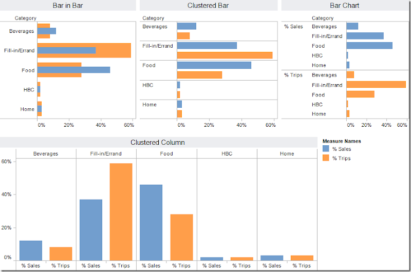
The purpose of Nielsen’s pie charts is to compare the % of total trips to the % of total sales. But there’s no way to do it effectively or quickly if your eyes are having to constantly scan back and forth in an attempt to compare their sizes.
Any of the bar/column charts below is a considerable improvement over the pie charts. My favorite of the options below is the bar-in-bar chart. You can quickly see that fill-in/errand trips are the most frequent, but food trips dominate sales. Which is your favorite?
February 3, 2011
UPDATED AGENDA: February Atlanta Tableau User Group (ATUG) meeting – February 17th from 1-4p @ Coca-Cola
The next ATUG meeting will be February 17 @ 1PM ET
Who - All ATUG members and guests
What – The February in person hands on meeting
Where – Coca-Cola - 2 Coca Cola Plaza, Atlanta, GA 30313, learning room 6
Important – You must check-in with security and tell them you are there for the Atlanta Tableau User Group meeting. They will then call me to come get you. I will have people in the lobby to help usher you to the training room as the room is across the campus.
Plan to arrive at least 15 minutes early
RSVP – http://events.linkedin.com/February-Atlanta-Tableau-User-Group-ATUG/pub/551737
Agenda:
- Demonstration – Grouping & Joining: Tableau vs. Excel (Bryan Hoskins, Athens Regional Medical Center)
- Training – Sorting, Grouping & Sets (Bryan Hoskins)
- Team project – Are you ready for some football?
- Open forum –
- March meeting – location, time, agenda
- Steering committee changes – who wants to help?
-- This will be a hands on session - Bring your laptop and Tableau with you --


