February 9, 2015
Makeover Monday: Beyond the Box Score - Which Teams Outperformed Their Predicted Win %?
bar chart
,
baseball
,
Beyond the Box Score
,
change
,
difference
,
Kevin Ruprecht
,
lollipop
,
Makeover Monday
,
slope graph
,
tableau
2 comments
Reader Kevin Ruprecht, reached out to me last week with this tweet:
Kevin is new to Tableau, so it takes quite a bit of courage to post on a site as large as SBNation.com. We should all be cognizant that there are tons of people learning Tableau every day. We need to be thoughtful with our comments and the words we choose when we respond. Think about how you would feel if you were new to Tableau and someone commented negatively about your first viz. What would you want to hear? How would you feel?
In the end, we should all be kind to everyone we meet. We want to be an encouraging community.
Here's Kevin's original viz. Click on the image to go to the original article.
 My initial thoughts:
Some of the changes I made:
@VizWizBI Just read your article on the Cali vax rates and VotD. Would you mind taking this down/offer advice? http://t.co/oCMoCnIiV3
— Kevin Ruprecht (@KevinRuprecht) February 4, 2015
Kevin has been following my Makeover Monday series and wanted some advice/feedback. He and I are going to do a screen share session later today to talk about his viz, my makeover, and my thought process. Thanks for asking Kevin!!Kevin is new to Tableau, so it takes quite a bit of courage to post on a site as large as SBNation.com. We should all be cognizant that there are tons of people learning Tableau every day. We need to be thoughtful with our comments and the words we choose when we respond. Think about how you would feel if you were new to Tableau and someone commented negatively about your first viz. What would you want to hear? How would you feel?
In the end, we should all be kind to everyone we meet. We want to be an encouraging community.
Here's Kevin's original viz. Click on the image to go to the original article.

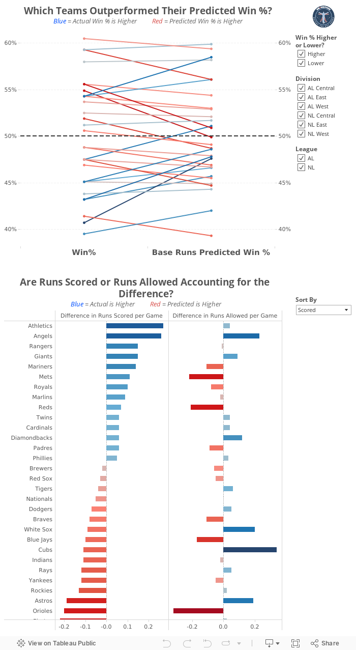
- Where's the title? What is this about?
- Why don't the stats in the slope graph match the stats in the lollipop chart?
- What is BaseRuns?
- Which font did Kevin choose and why?
- There are some formatting changes that need to be made.
- What does "BR Filter" mean?
Some of the changes I made:
- Change the overall font to Helvetica Neue
- Added titles that describe what each chart is about
- Updated the "BR Filter" to something more understandable to the average reader
- Reformatted the slope graph, including: adding gridlines, changing the reference line, adding a secondary axis to aid in reading, reversed the colors
- Replaced the lollipop chart with a bar chart that shows details about the stats in the slope graph, making it a two-part story
- There are some other things as well, but those are the biggest changes.
Subscribe to:
Post Comments
(
Atom
)


Hi Andy - great post as always. But wouldn't a Gantt chart be cleaner and more easier to read? Comparing between the BR and PP predictions would also be easier (I get that this wasn't in the objectives of the viz).
ReplyDeletehttps://public.tableausoftware.com/views/baseruns/Sheet2?:embed=y&:showTabs=y&:display_count=no
Nice work Deepthi! I hadn't even thought of displaying it that way. I really like what you've done...thanks for sharing!
Delete