May 11, 2015
Makeover Monday: Why Are There so Many More Muslims in U.S. Prisons?
bar chart
,
difference
,
fivethirtyeight
,
Makeover Monday
,
prison
,
religion
,
slope graph
,
tableau
No comments

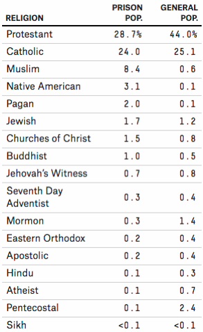
FiveThirtyEight.com recently published an article about the difference in the religious beliefs of prisoners in the U.S. vs. the general U.S. population. In this article, they provide this table:
They go on to do an analysis, but never really address the story the data is telling in this table. Clearly what this table is screaming out for is to show the difference between the two populations. I’ve been on a bit of a slope graph kick lately, so that’s what I’m using again this week. Why? Because I find slope graphs to be an excellent way to show variances between two data points.
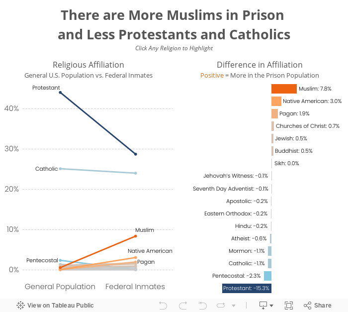
The slope graph clearly makes the differences stand out. One can easily see that there are fewer Protestants and Catholics in prison, and at the same time see that there are way more Muslims in prison. I then like to supplement the slope graph with a bar chart that shows only the differences.
There’s no clear evidence available as to why this is, but representing the data this way leads to more questions and more discussion. Any time you design a viz and it continues the conversation, you’ve probably done something right.
They go on to do an analysis, but never really address the story the data is telling in this table. Clearly what this table is screaming out for is to show the difference between the two populations. I’ve been on a bit of a slope graph kick lately, so that’s what I’m using again this week. Why? Because I find slope graphs to be an excellent way to show variances between two data points.
The slope graph clearly makes the differences stand out. One can easily see that there are fewer Protestants and Catholics in prison, and at the same time see that there are way more Muslims in prison. I then like to supplement the slope graph with a bar chart that shows only the differences.
There’s no clear evidence available as to why this is, but representing the data this way leads to more questions and more discussion. Any time you design a viz and it continues the conversation, you’ve probably done something right.
Subscribe to:
Post Comments
(
Atom
)


No comments
Post a Comment