January 25, 2016
Makeover Monday: Two-Thirds of Americans Don’t Have Enough Money Saved
For this week's Makeover Monday, we look at this article from Go Banking Rates. In the article, there are two charts that need some work. First, there is this exploding donut chart.

What works well?
- The data is sorted clockwise by the savings amount.
- The donut chart starts at 12 o'clock.
- The labels tell us the actual values.
What needs improvement?
- Remove the donut as it's hard to compare slices.
- By adding all of the labels, they've basically created a table.
- The title could be improved.
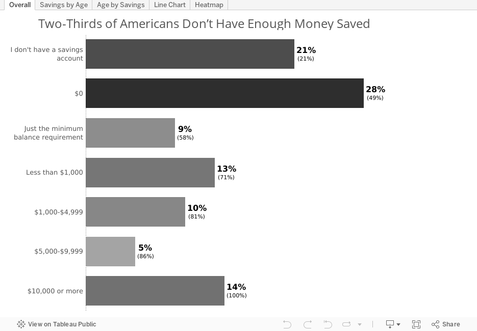
Here is my initial makeover of this chart:

In this view, I've incorporated a few elements to aid in understanding:
- The title is more meaningful and let's the reader know what they are looking at.
- I colour-coded the bars by the survey response rate.
- I labeled the bars with the response rate and the cumulative response rate.
- I kept the sort order by the savings amount. This makes it easier to see how little savings people have.
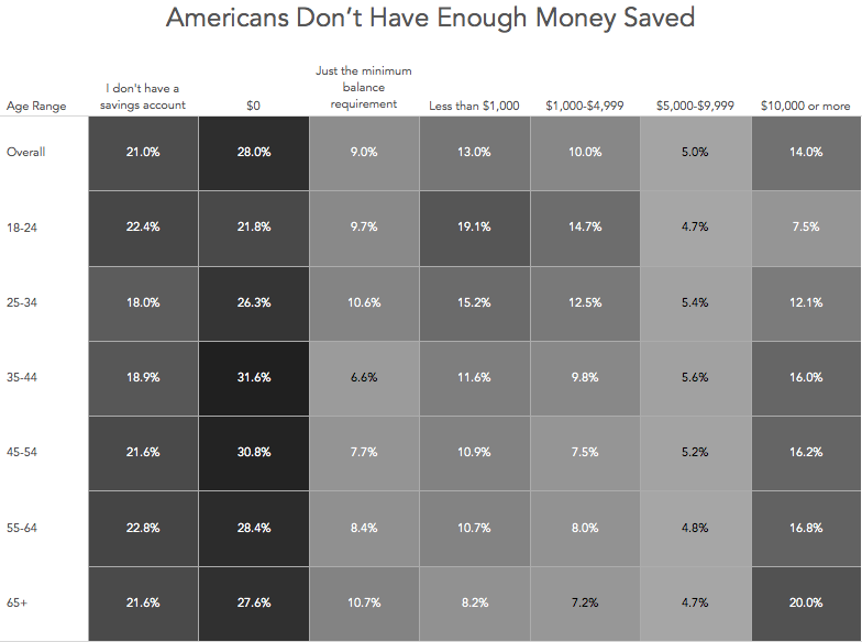
Ok, so that's a quick glance at the overall numbers. The article later breaks these down by age groups in this stacked bar chart.

Again, this chart has several issues that hinder comprehension:
- The title is pretty meaningless.
- The stacked bar chart allows you to only easily compare the first and last segments across ages.
- I find the text on the bars to be distracting.
- I have to look back and forth to the colour legend to keep things straight in my head, which slows down comprehension.
To makeover this chart, I iterated through several options, none of which I really love, but I like them all better than the stacked bars.

This view is useful in that it allows me to compare the different savings amounts for each age group. What it lacks, though, is the ability to compare across age groups for the different savings amounts. To do that, I need to flip the chart like this:

Great, but ideally we should be able to compare in both directions. A line chart can help me understand and compare the data across both dimensions.

What I like about the line chart is that it helps me see patterns better. For example, you can clearly see that as people age there are more people with $10,000 or more in savings. At the same time, I can understand the mix within each age band.
One last alternative that works similarly to a line chart, except the patterns aren't as easy to see, is a heat map.
The heat map is great in that it shows me concentrations and I can include to overall values. The downside is that the patterns are not as easy to distinguish as the line chart.
Overall, this exercise showed me that there's no one "best" way to visualise this data set. The chart I would choose to display would depend on the message I want to send and the question my audience needs to answer. Below is the Tableau workbook with all of my iterations.
Subscribe to:
Post Comments
(
Atom
)


No comments
Post a Comment