May 27, 2016
Fix it Friday: Early Leavers from Education and Training in Europe
On the train to work this morning I was reading through the blogs I follow and ran across this amazing visualisation from Stephanie Evergreen:
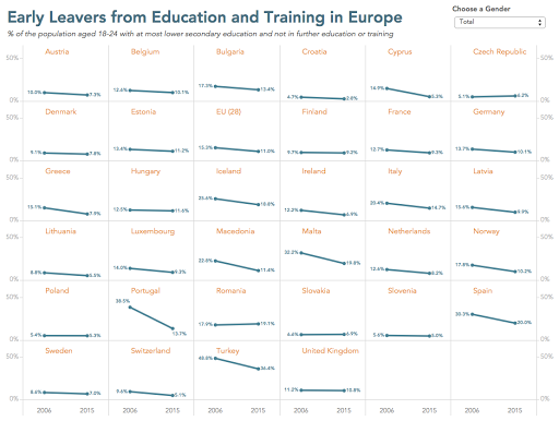
I love small multiples and I love slope charts, and this in an amazing combination of the two. Shortly thereafter, I ran across this chart from the Financial Times:
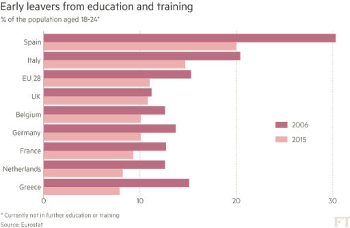
To me, this chart is screaming out for a slope chart. Also, I don’t understand why they didn’t include all countries in Europe. I downloaded the data from Eurostat and created this small multiples slope chart in Tableau.
I also was able to include an option that allows you to pick a gender or the overall. Notice how the title changes color to match the lines in the slope graph. Do you know how I did that?
Which one do you think tells the story better? Does the bar chart of the slope chart make comparing the years easier?


